

For the longest time, we looked elsewhere for inspiration.
We looked West for our trends, our snacks, and our flavors.
But the tide has turned.
There is a new India rising, one that doesn't feel the need to choose between its grandmother's recipes and its global ambitions. We are a generation that is modern by choice, but ethnic by soul. We are confident, we are self-assured, and we are finally coming home to the flavors that shaped us.
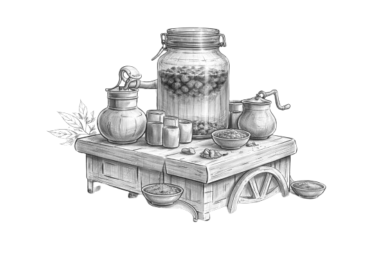
Our journey began on the vibrant, dusty street corners of this country, with the sound of a heavy metal juicer, the scent of roasted cumin, and the sight of a vendor's stained wooden cart. These are the flavors of our reality, the "Street Wala Zing" that a fancy bottle could never quite capture…Until now.
We have taken those legendary street-side recipes, the ones that have cooled our summers and spiced our winters for centuries and have given them the platform they deserve. No artificial masks, no watered-down traditions. Just the authentic, bold, masala-dusted soul of India, bottled for the person on the move.
This book is a tribute to those fruits, those streets, and the spirit of a nation that is finally proud of its own palette.
Welcome to the
STREET WALA ZING.Design, at its best, is a memory made tangible. When we set out to create the silhouette for our bottle, we didn't look at modern beverage aisles. We looked at the cluttered, colourful wooden carts that line the gullis of India. Modernity with a Grip with aesthetics rooted in tradition. It's designed to fit perfectly in a car cup holder, a gym bag, or a firm grip during a busy commute. It is a vessel that feels substantial; a weight that reminds you of the quality within.
The 'Berni': The unique, faceted geometry of our bottle is a contemporary salute to the classic Barni (jars) and the heavy, ribbed glasses used by street-side juice walas. Its structured grip and bold shoulders reflect the ruggedness of the street, while its crystal-clear clarity showcases the vibrant, natural hues of our masalas.
The typography is loud and unapologetic, much like the calls of the vendors we grew up listening to. It's a mix of street art, grit, clean & premium finishes. Every curve of the bottle and every word on the label is a commitment to our vision.
Packaging That Is Global In Its Quality, But Unmistakably Indian In Its Soul.
"May your days always have a little extra masala, and may you never be too far from the taste of home."
We grew up on the same streets you did. We stood in the same queues for a glass of Ananas juice after school and shared the same salt-rubbed Amrud on train journeys.
We created this brand because we realized that while India was moving forward, our favorite flavors were being left behind on the sidewalk. We wanted to build something that was as sophisticated as a global beverage, yet as familiar as a conversation with an old friend.
To the roots that hold us,
and the wings that take us forward.
This isn't just a business for us: it's a mission to bottle the spirit of India.
Thank you for being part of this journey.